- Seattle’s NHL team will be called the ‘Kraken’ when they begin play in the 2021-2022 season.
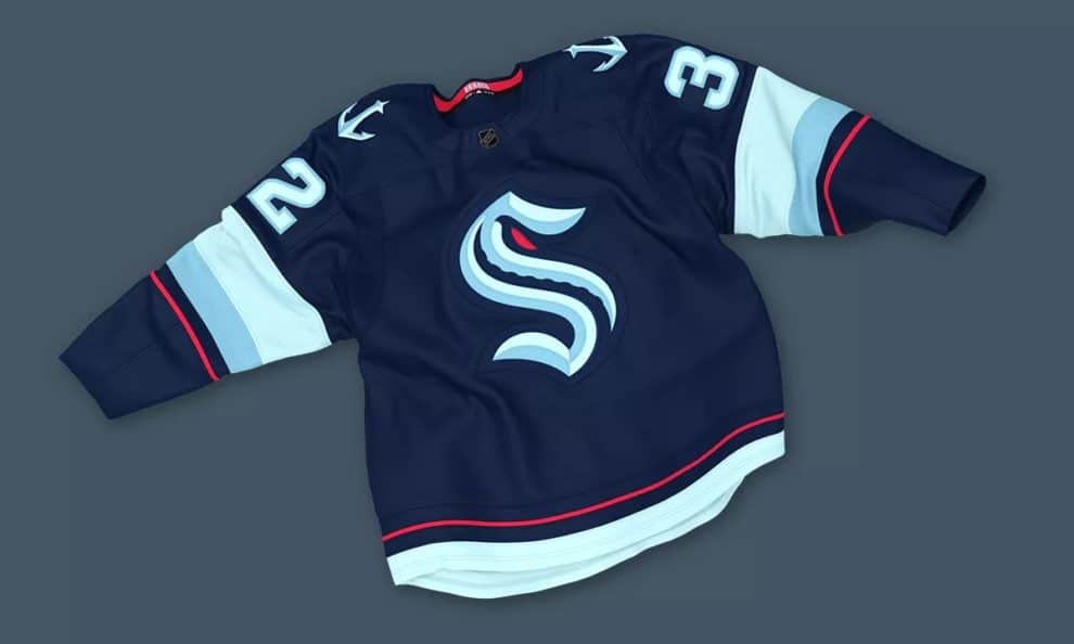
- The team’s logo is a stylized ‘S’ and the team colors are various shades of blue with a touch of ‘red alert’.
- The ‘S’ logo pays homage to the Seattle Metropolitans of the Pacific Coast Hockey Association who were the first US team to win the Stanley Cup in 1917.
After 19 months of uncertainty including a delay due to the COVID-19 pandemic, the Seattle NHL expansion team finally has a name. They will be known as the ‘Kraken’ which is ‘a legendary cephalopod-like sea monster of gigantic size in Scandinavian folklore’. In other words, a really big octopus-looking sea creature. The Seattle Kraken will be the NHL’s 32nd team and start play in the 2021-2022 season.
There were several names reportedly under serious consideration including Sockeyes, Evergreens, Metropolitans and even the Thunderbirds (the name of the Seattle junior hockey team). By all accounts, however, ‘Kraken’ was the fan favorite as team SEO Tod Leiweke confirms:
“The Kraken is a name born of the fans. It was suggested and championed by the fans.”
“We’ve heard from tens and tens of thousands of fans, and we’ve spent two years listening. Every day for the past two years, we’ve thought about this moment, and we knew if we did listen, we couldn’t go wrong, that we would be in a position, if we simply listened, to build that next great team brand.”
Heidi Dettmer, Seattle’s vice president of marketing, has grown fond of the name already:
“I think that we felt like this is so authentic and noble, and we hit all the main things that we really wanted that we feel really strongly that this is the right choice. I’ve totally fallen in love with this brand and I think our fans will.”
The team colors are various shades of blue, evocative of the sea itself. According to NHL.com:
The primary color is deep sea blue. The secondary colors are ice blue, shadow blue, boundless blue and red alert.
The logo honors the Seattle Metropolitans of the Pacific Coast Hockey Association, who became the first team from the United States to win the Stanley Cup when they defeated the Montreal Canadiens in 1917, months before the NHL was born. It is an “S,” like the Metropolitans logo, but with a tentacle and red eye.
Kraken general manager Ron Francis gave his take on the nickname:
“Seattle’s a city with a deep maritime history. I think this name embodies a connection with the sea and a curiosity of what lies beneath it. It’s a natural tie to Seattle and the Pacific Northwest.”
“In theory, it reflects the power and aggression in the game of hockey. We’re hoping that’s the kind of tenacity our players show every time they take the ice. So I’m excited by it.”
NHL Commissioner Gary Bettman added his ‘huzzahs’ to the fray:
“The jersey design is terrific, and I can’t wait to see NHL players wear the unique and distinctive ‘S’ on their chests on opening night; it will have special meaning for Seattle hockey fans. I’m thrilled to welcome the Seattle Kraken into the National Hockey League.”
The team is already selling merch branded with the slogan ‘Release The Kraken’ with all proceeds through August 21 going to local youth charities.